How layout changes reading comprehension
A small experiment on whether line length and type size change how much readers remember.
Published
15 February 2026
Designers have strong opinions about line length and type size, but how much do they actually affect understanding? This study design describes a small online experiment comparing three layouts of the same text, measuring reading time, recall and preference. Results will be added once data is collected.
Status: study design. I am publishing the plan before collecting any data, so that the method cannot be adjusted to fit the results.
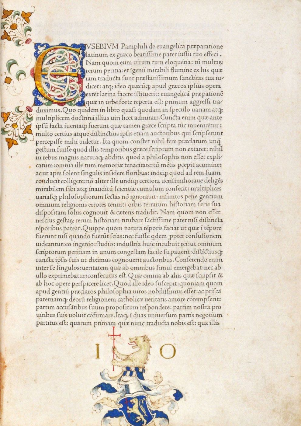
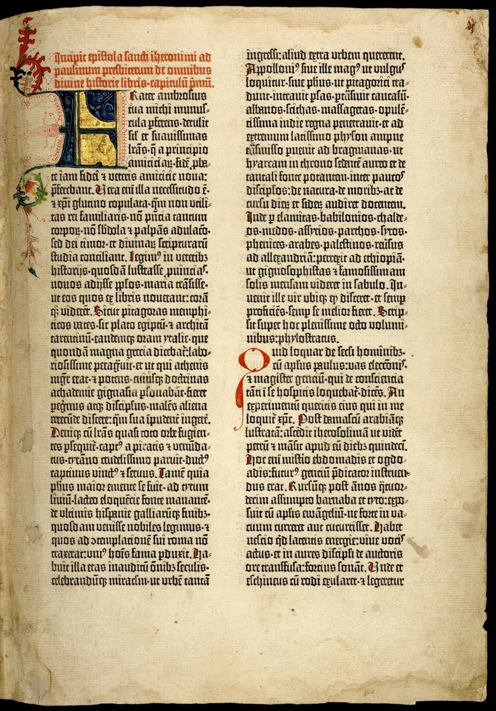
Designers have strong opinions about line length and type size, and most of those opinions are inherited from printers. Typography guides commonly recommend lines of roughly 45 to 75 characters for continuous reading, with something around 65 often given as ideal, and body text large enough to read without effort. These rules come from five centuries of practice, from the first printers who had to decide how wide to make a column of type and how many lines to fit on a page. The Gutenberg Bible of about 1455 was set in two columns of 42 lines each, following the manuscript Bibles it imitated, rather than in lines running the full width of its large pages. The roman typefaces cut in Venice a few years later, such as Nicolas Jenson’s of 1470, set a standard for readable text that type designers still study.
Research on reading from screens has added nuance to the printers’ rules. Studies since the 1980s have compared line lengths and found that the answers depend on what is being measured. Longer lines can sometimes be read slightly faster, perhaps because the eye makes fewer return sweeps to the start of a new line, while readers often say they prefer shorter or medium lines and find them more comfortable. Comprehension, meanwhile, has often shown little difference across the range of layouts tested. In other words, speed, understanding and preference do not always move together, and it is easy to confuse a layout that feels pleasant with one that helps people understand.
I want to test a narrow version of the question on a modern screen: does line length change how much people understand and remember, or does it only change how the page feels?
Design
Each participant will read one short, unfamiliar non-fiction text of about 800 words, presented in one of three layouts assigned at random. The layouts differ only in the width of the text column.
| Layout | Characters per line | Type size |
|---|---|---|
| Narrow | about 45 | 18 px |
| Medium | about 70 | 18 px |
| Wide | about 110 | 18 px |
Everything else stays the same across the three versions: the typeface, the line spacing, the colours, and the text itself. Keeping the type size fixed means that any difference between groups can be attributed to line length rather than to a change in how large the letters are.
I will measure four things. Reading time will be recorded by the page itself, from the moment the text appears to the moment the reader moves on. Comprehension will be tested straight after reading with eight multiple-choice questions, half about specific facts in the text and half about its main argument, since layout might affect those two kinds of understanding differently. Recall will be measured with one open question, asking the reader to summarise the text in three sentences, which will be scored against a checklist of key points written before any data comes in. Finally, preference will be measured with a simple rating of how comfortable the text was to read.
What I expect, and what would surprise me
My guess, based on the earlier research, is that the medium layout will be rated most comfortable, while comprehension and recall will barely differ between the three layouts. That would support the view that line length is mainly a matter of comfort. If comprehension or recall does differ clearly between layouts, that would be the more interesting result, because it would suggest that layout affects understanding and not only how reading feels. Either outcome will be reported.
Limits
This is a small study run by one person, not a laboratory experiment, and it should be read that way. Participants will read on their own devices, at different screen sizes and in different conditions, which adds noise that a laboratory would control. I will aim for at least thirty people per layout, which is enough to detect a large difference but not a subtle one, and I will report the uncertainty around every result rather than only whether it crosses a threshold. One text in one typeface cannot speak for all reading, and a result here would be a reason for a larger study rather than a conclusion in itself.
What I will publish
When the study is done, I will publish the test page, the anonymous data, the scoring checklist and the results, whatever they show. If the experiment fails for practical reasons, such as too few participants, that will be reported too.
Ayoub Khallok keeps this archive of essays, research, lessons and notes, written to understand things more clearly. More about Ayoub.